March 1, 2022
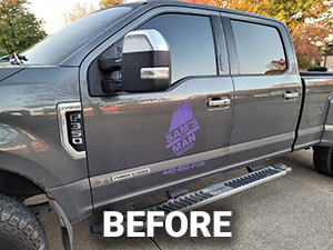
Sam’s The Man Tree Service consulted Bullseye to improve their business vehicle’s graphics. The vehicle already had existing graphics on the door, but the tree service wanted better visibility on their brand.
Bullseye designed and printed a graphics package offering several improvements


Logo Orientation
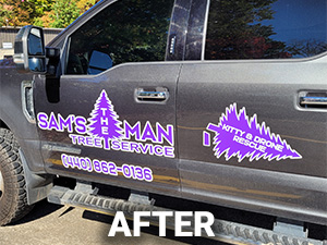
The existing logo was tall and tilted at an angle to the left which caused space limitations when applied to the door. Bullseye straightened the logo and redid the type so it could be made much larger and more visible on the door. This also enabled Bullseye to enlarge the phone number and make that more visible.
Logo Placement
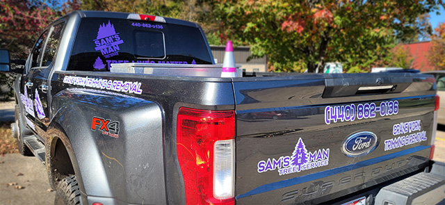
In addition to door graphics, Bullseye recommended that Sam’s The Man place graphics on the bed and tailgate so that people behind the vehicle could also see the advertising.
Logo Design
Bullseye outlined Sam’s The Man corporate purple with white so that the lettering and graphics stood out from the vehicle’s dark gray canvas.

Sam The Man’s Tree Service was very pleased with the logo design and new decals on the truck and Bullseye was happy to work on the project!


