April 1, 2024

A Deep Dive into Logo Variations… How, When and Where to Use Them
A logo isn’t just important, it is personal. Sometimes the logo is the first and only interaction with a new customer, and it can set expectations of excellence with each impression along the way. Who sees it, where they see it, and what a customer sees is a big part of any successful marketing campaign.
Many businesses have one logo and one color scheme. While that’s a good start, it may not serve the many opportunities you have to be successful with your branding efforts. Different color schemes, variations on messaging, and logo placement all interact to create a need for a strategic logo plan.
Where you place your logo is nearly a limitless list. Website, social media, signage, business cards and letterhead are obvious needs. You’ll likely want screen-printed t-shirts and hats, embroidered activewear, and practical pieces like packaging and branded merchandise. You may someday consider placing your logo on vehicles, in trade show displays and on promotional items, from pens to coffee mugs, and more.
Here’s a video that shows more on different ways to use logos in your marketing.
That’s a lot of options and a lot of opportunities to make a lasting impression.
Here are some tips to help you formulate a strategic marketing plan for your logo usage.
 Consider Logo Variations
You may want to think about adopting a three-tier logo strategy:
Primary Logo
This is the main image your audience sees on outside signage, letterheads and official big picture marketing efforts.
Secondary Logo
A Secondary logo can be a simpler, less intricate or less involved design for special purposes. For instance, some logos work better for screen printing purposes and others for embroidery. Or think about a secondary logo based on regions or signage restrictions. You may even want to adopt official secondary logos for holidays, or seasonal campaigns.
Tagline Logos
 Sometimes the tagline is part of the official logo. If that works for you, that is fine. However, a
tagline adds complexity. Taglines can also be subject to change as business climates progress. A
separate logo created for a tagline can allow for future change, without forcing primary logo
corrections.
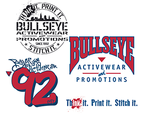
For example: Here at Bullseye Activewear and Promotions, we have our primary logo, secondary logo, and tagline logo. They can go together or be used in separate areas. Each has a purpose for various placements, including but not limited to outdoor signage, limited-edition branded merchandise, and areas where messaging is more important than brand name.
Consider Color Variations
For example: Here at Bullseye Activewear and Promotions, we have our primary logo, secondary logo, and tagline logo. They can go together or be used in separate areas. Each has a purpose for various placements, including but not limited to outdoor signage, limited-edition branded merchandise, and areas where messaging is more important than brand name.
Primary Colors
Choose no more than 2-3 colors that are designed to stand the test of time. At the same time, create black and white versions in anticipation of need. You’ll want these
Secondary Colors
Anticipate opportunities. Be flexible. You may not need to preset the variations, but be willing to adapt based on background color, printing material, etc. For example, your red logo is perfect almost all of the time, unless it is being used on a black background. The first rule of using a logo is that it should look great, and sometimes that requires some adjustment.
Tagline Colors
These are meant to be read, and must be simple. The monochrome approach is good and can have different backgrounds or effects as needed.
Finally, be sure to document your logo usage with some kind of an official brand kit. Whatever your logo plan is, make sure you are working with a professional who understands how and where it needs to be placed, and which versions and variations can be used where. When it comes to your logo, an “on purpose” strategy can help you maintain consistency in a constantly evolving landscape.


